Fraunces
Wear
the noise
A wonky old-style serif with real character in the curves. Used only for statements — never for anything a reader has to work through.
AaBbCc — 0123456789
In-house project — 01
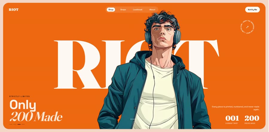
Start a projectAn in-house project — brand and landing page for a limited-run streetwear concept. “Wear the noise.”
01 / Why we built it
We build in-house projects to work through problems we keep meeting in client briefs. This one is drop culture: a brand sells 200 numbered pieces, never restocks, and has to say so on a landing page — where scarcity marketing has become its own genre of noise, all countdown timers and red banners.
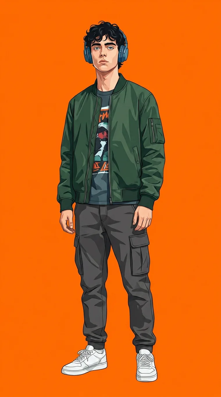
We invented RIOT as the vehicle and set ourselves one rule: make “this disappears” read as a fact about the garment, not a sales tactic. The countdown stays quiet, the numbers speak plainly, and the clothing gets the room.
With no client to please, it doubles as our own proving ground — the hero sequence and scroll work here went on to inform how we build for clients.
02 / Identity
Fraunces at weight 900, optical size cranked high. The soft serif keeps it from reading as a sportswear logo, while the weight carries the volume the name promises.
03 / Typography
Wear
the noise
A wonky old-style serif with real character in the curves. Used only for statements — never for anything a reader has to work through.
AaBbCc — 0123456789
240 GSM
heavyweight
Neutral, slightly technical, and it holds up at 13px in a spec label. Carries every price, size, button and paragraph on the page.
AaBbCc — 0123456789
Type scale in use
Display — statements
Section head
Body — 16/1.6, the reading size
Label — specs, prices, buttons
04 / Colour
The page sits on cream, not white — closer to a paper mailer than a storefront. Orange is reserved: it marks the drop, the countdown and the buy action, and appears nowhere else, so it always means “act”.
#FA6F0A
Primary signal. Drop marker, countdown, CTA.
#E15F00
Pressed and hover states.
#F6D8C6
Page ground. The default surface.
#FAE7DB
Raised cards and panels.
#16130F
All body copy and headlines.
#2A241D
Secondary text, rules, borders.
#123A47
The cool counterweight. Used sparingly.
#FFF8F2
Type on dark, product highlights.
Ink on cream measures 14.8:1 — comfortably past WCAG AAA. Orange is never used for body text; it carries meaning through position and repetition instead of being asked to stay legible at 16px.
05 / Brand assets
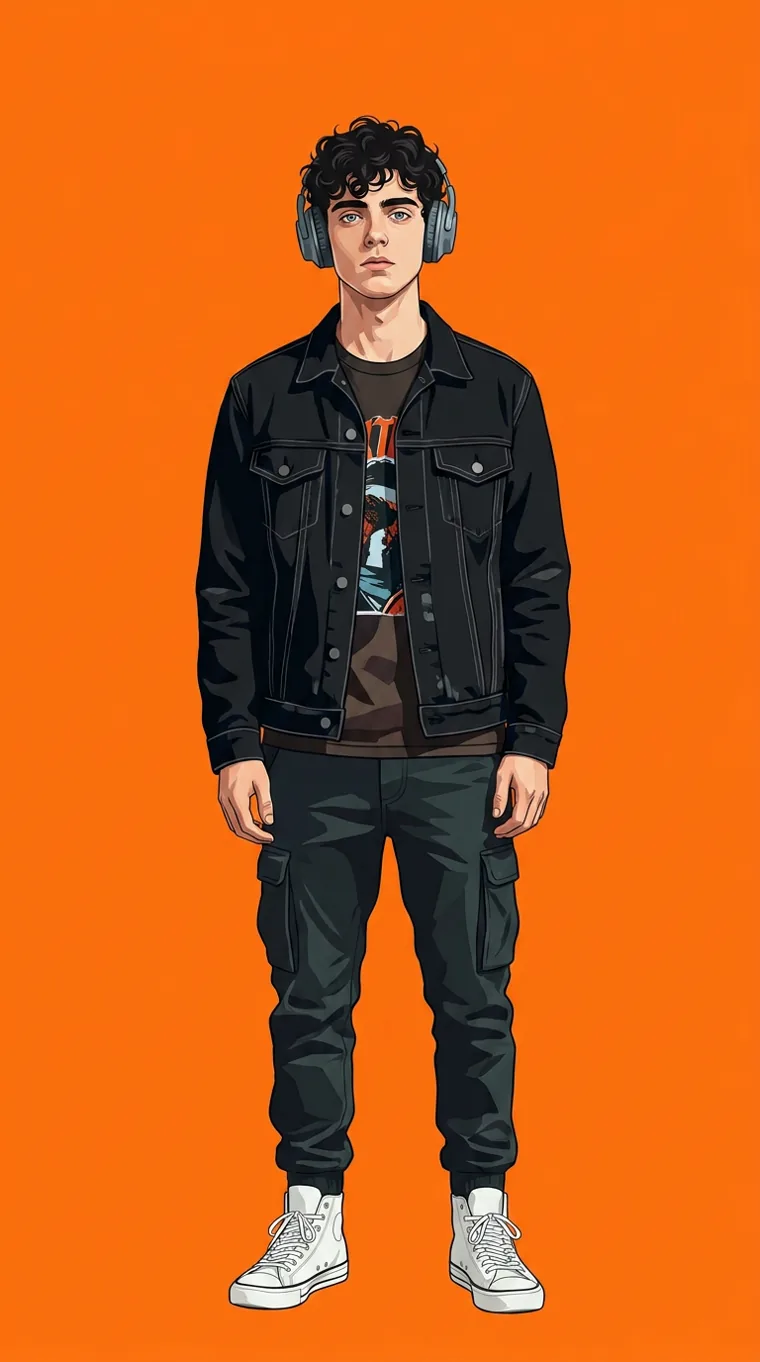
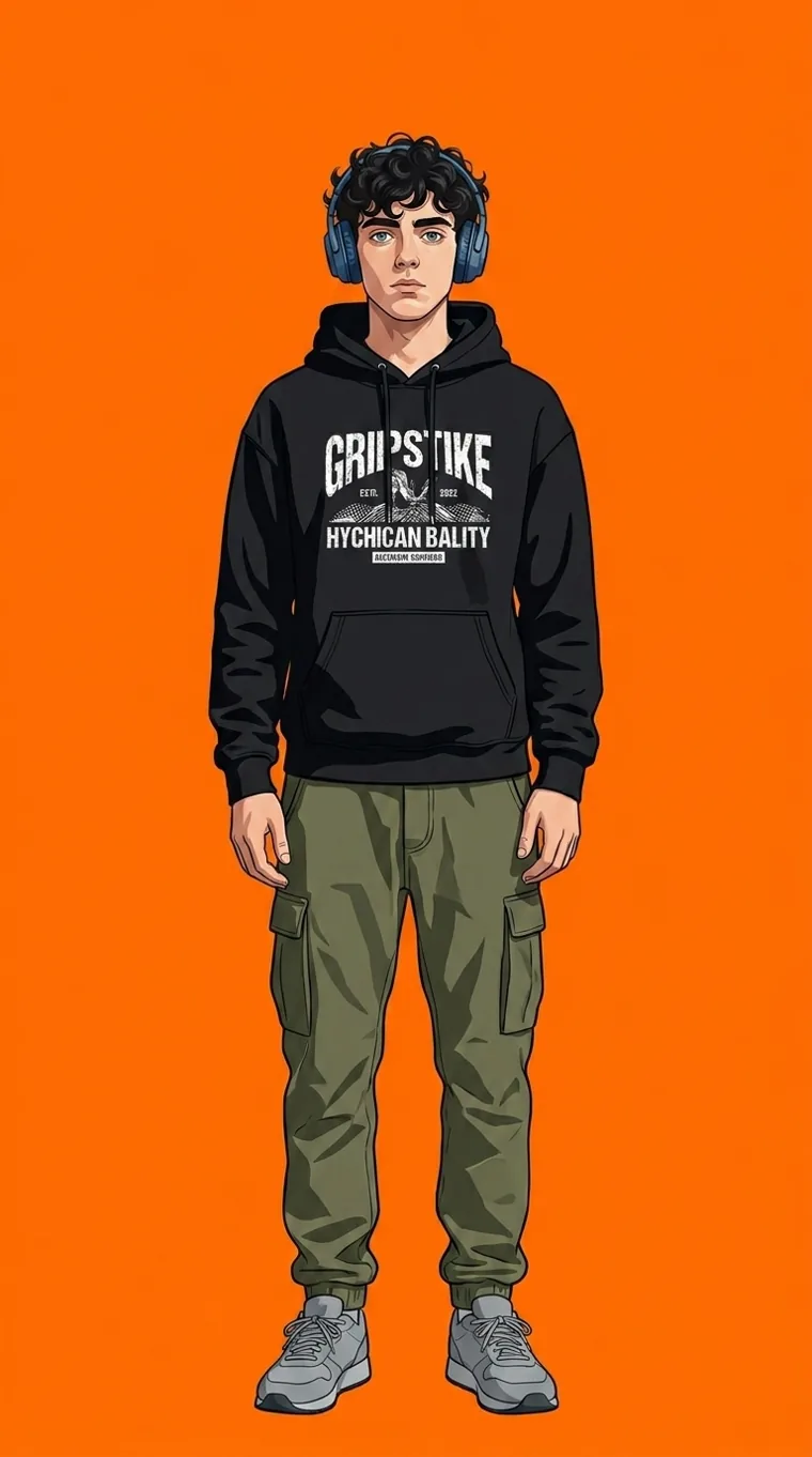
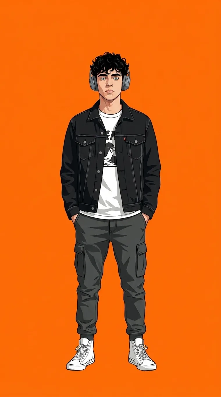
Asterisk
Marquee separator and drop marker.
Drop numbering
Every run is numbered and retired.
Edition stamp
Pieces per drop. Never restocked.
06 / Build
The hero is a 121-frame image sequence scrubbed by scroll — the kind of thing that usually costs several megabytes and a slow first paint. Frames are WebP, decoded ahead of the playhead, and the first frame is preloaded at high priority so the page paints instantly and the sequence fills in behind it.
The lookbook rail is drag-to-scroll with snapping disabled mid-drag and scroll writes batched to one per frame, so it tracks the cursor 1:1 instead of fighting the browser's snap.
07 / See it running
Live Open the RIOT site riotstore.netlify.appNext
Fathom